First stab at step one, attempting to help illuminate the confusing process of getting the right software installed depending on how the user typically sends email.
Case Study
replyforall
Company & Brand Mission
ReplyForAll.com was an innovative start-up with a unique business proposition for creating new, high-engagement advertising real estate in personal email signatures. Users could create a personalized email signature that contained an ad tag. A portion of the proceeds from the advertising were donated to one of 8 different charitable causes
My Role
I worked closely with the company founder to redesigned the key email signature creation interface and sign up process, turning an arduous, form-based process into a visually interactive creation experience, significantly increasing sign-up conversion rate.
Landing Page Iteration
Here’s a few highlights from our work improving the conversion rate of our landing page.
2
Round 1- Sign Up Flow
One of the main problems replyforall had to deal with was the technical challenge of getting the email signature into the user’s email messages.
Replyforall created browser and email client add-ons that accomplished this, but our target audience was generally inexperienced with installing this kind of software. Our qualitative research indicated the complicated if/else/or logic of getting users to their correct version of software was a major reason for the low conversion rate.
First stab at step one, attempting to help illuminate the confusing process of getting the right software installed depending on how the user typically sends email.
3
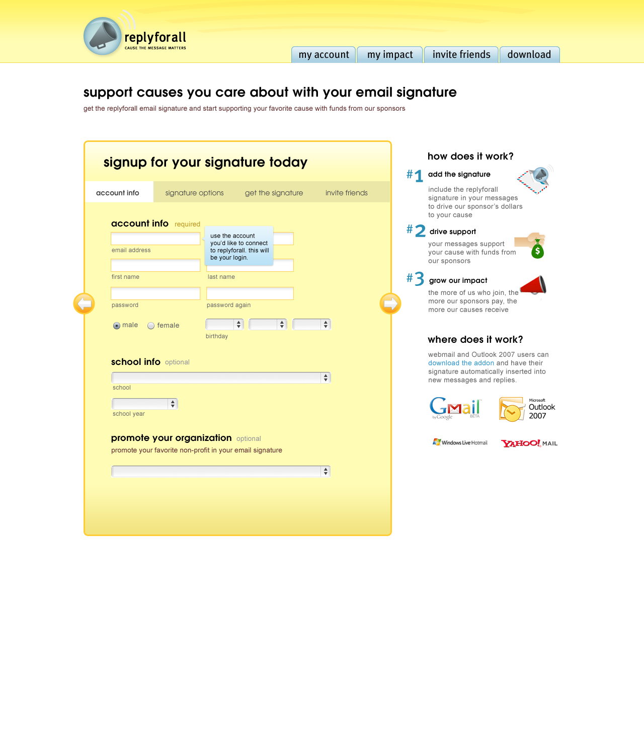
Round Two - Sign Up Flow
After showing our Round One mockups to user research participants we discovered we had the process entirely backwards. Our first iteration made the first step about the technical challenges, the lease interesting part for our users, causing people to bail at the beginning of the funnel. For round two we moved the installation process to the end of the sign up flow.
4
Round 3 - Sign Up Flow
After getting user feedback on Round Two we still felt that we missed the mark. In Round Two we still had the account setup step first, before the email customization step, because the backend needed an account in order to display a signature.
For Round Three, we decided to re-implemented the backend to allow previews of signature designs without an account. This allowed us to start the funnel with the email signature customization step, which also allowed us to redesign the customization interface to focus on the fun process of creating something and make the account setup appear secondary.
The conversion rate for this version was in the 15-20% range, several orders of magnitude greater than the 1-2% we started with.


