Corporate Intranet Redesign
I helped Orrick explore new design ideas for their corporate intranet.
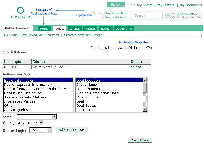
The structure and organization of the client’s intranet was in a constant state of change and practices and working groups changed and reorganized. This design depicts a centralized navigation in flexible menu system. Because the labels for the top-level navigation options are not incorporated into the design, they can be easily changed and contain words of any length, allowing for better understanding and more descriptive organization as well as growth and easy reorganization as the company grows and changes.
Illustration of new navigation concept on existing business application. Since all of the navigation under the header is specific to the sub application, these sub-sites and applications are released from the burden of incorporating site navigation as well as their own.
An example of the homepage of a sub-site or internal web-based application homepage. Links that used to be hard to find are now only 2 clicks away from the intranet homepage.


