Case Study

HubPages

May 2012 - March 2013

Company & Brand Mission

HubPages is a online publishing platform and ranks among the 100 most-visited sites on the internet. HubPages provides writers and content creators with a simple way to monetize their content.

My Role

As Director of User Experience I was responsible for improving satisfaction with HubPages among their vibrant community of 50k published authors.

Designing the HubPages Progress Bar

My work on the HubPages progress bar below is a good example of testing out a lot of ideas quickly using low fidelity wireframes to get user feedback, then iteratively testing concepts while moving into higher fidelity mockups.

1
Round One

Collect everyone’s ideas and show them to users

HubPages wanted a “progress bar” to help incentivize users to generate longer content because HubPages believed that longer content would increase the long-term SEO value of the user’s content. I used the opportunity to introduce the team to a research-led design process to get feedback on the teams ideas.

I began with a stakeholder meeting to collect the team’s goals, assumptions, and implementation ideas. I then produced wireframe versions of the team’s initial concepts and showed these wireframes to users recruited from the community via online Skype interviews. The project proceeded through several rounds of increasingly finalized wireframes followed by photoshop comps.

LinkedIn

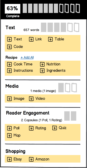
This wireframe captured the team’s initial ideas for a progress bar that would help users create longer and more potentially successful content.

Show me the data

I proposed that content authors might be motivated by access to the same information that motivated HubPages to recommend longer content. This wireframe was used to gather user feedback on a more visual representation of the underlying reasons why longer content would be beneficial.

Visual incompleteness

This wireframe helped gather feedback on the idea of providing visual feedback of “incompleteness” in the existing publishing tools interface.
2
Round Two

Review user feedback with team, collect ideas for next iteration, repeat

After presenting the results of the user interviews from the first wireframe iterations to the team I produced another round of wireframes to validate some of the observations from the initial user interviews.

Reframe the goal

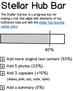
Research participants showed negative reactions to the wireframes that presented arbitrary or unclear “success” metrics of their creative efforts. Including “traffic” in the heading of this wireframe was used to investigate if these negative reactions persisted when the goal was stated as “traffic” rather than success or quality.

Highlight helpful tips

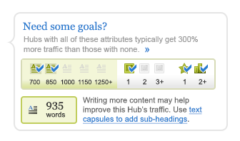
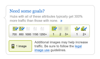
Research participants showed positive reactions to data, tips and any specific and truly relevant information that would help them create higher quality content. This wireframe was used to gather feedback on the usefulness and potential problems of presenting this information more directly to users.

Clarify calculation

Participants also showed frustration with the first iteration of because it was not clear how the progress bar was calculated. In order to understand if this was the reason why they were not as drawn to the LinkedIn-style progress bar, this wireframe retained the LinkedIn-style layout but clarified how the calculations were formed.

3
Initial Mockup

Review user feedback, collect workable ideas into visual design mockup

After several rounds of wireframes we needed the detail of Photoshop mockups to validate some of our conclusions from the user research. This design seeks to combine the usefulness of the Quality Checklist and the visual feedback of “incompleteness” from the “Fill in the Boxes” wireframe, while keeping a small development footprint.

Showing as mouse hovering over the text indicators.
Showing as mouse hovering over the image indicators.
Showing as mouse hovering over the content capsule indicators.

4
“Progress Bar” Final Implementation

Deliver and measure results

The final implementation successfully avoided many of the potential pitfalls uncovered during the initial user testing and wire-framing iterations.

The featured was initially released as an A/B test and instrumentation and reporting were provided to assess its effectiveness at helping users create longer content. The resulting data showed that the presence of the final implementation did not have any significant effect on the length of content. The nature of SEO made it impossible calculate the overall business value in the short term.

The feature was well-received in the community due and many specifically mentioned the messaging I wrote preempting many of the concerns uncovered in the user research. The community appreciated when HubPages shared raw data and were supportive of HubPages working to improve content quality on the site.