Case Study

CookBrite

October 2014 - March 2016

Company & Brand Mission

Become an indispensable tool to help the target demographic, busy moms, get a home-cooked meal on the table every night.

My Role

I led the design of several new product features and user interfaces, working to find product-market fit by shaping the user experience around the most compelling value propositions. I initiated and performed all user research.

1
Context: My Starting Point

2 years of design, 10% implemented

I joined CookBrite 2 years after its inception. About 30-50 wireframes with user flows had been mapped out for various features the app was envisioned to have. None of the flows had been prototyped and about 10% of it had actually been implemented in the preliminary app.

Research missing from design process

The company had conducted good initial brand research into the target demographic, busy moms, but gathering regular user feedback was not a part of the design process and it had been almost a year since the last user feedback.

Objective

Get user feedback, integrate research into the design process

After working with the team for a few weeks it became apparent that several questionable assumptions had been adopted by the team without validating them with users. My first objective was to get user feedback on what the team had built so far and use that experience to convince the team to include feedback as a regular part of the product design and development process.

Process

While it doesn’t show the detail, this user flow provides a high-level idea of what the initial sign up process looked like before I began doing user research.

I started by recruiting existing CookBrite users to participate in remote, moderated research sessions.

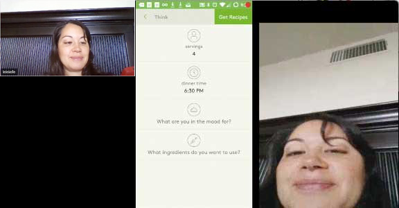
I then conducted remote interviews with users using a combination of Skype and Lookback to record the participant’s screen as well as facial reactions.

I’ve conducted several hundred hours of user testing similar to this, including hundreds of Usertesting.com test, but this was my first time testing a mobile app and my first time using Lookback on Android.

I reviewed the research with the product and design teams and produced reports to summarized insights for the company. The best insights typically come from discussion, but documentation is important to help the company understand what’s driving the decisions.

Our research validated that planning multiple meals was a key missing feature and barrier to adoption. We also knew that any other features we planned would be greatly effected by this feature, so we chose to prioritize finding a solution.

Since much with this project is still confidential, check out my Plum District case study for a slightly older example of a user research report that I’ve written.

Results

Compelling value proposition, not quite delivering yet

I successfully conducted the company’s first user testing using Skype interviews with users as well as UserTesting.com. The initial test validated for the team the importance of ongoing user testing.

Test participants found the app’s concept and value proposition compelling but the app did not yet deliver on its promise in several important ways.

Compelling Value Propositions Barrier to Adoption Proposed Solution
Scan your grocery receipt, see what you can make Can’t actually see what you can make Visually indicate if you have all the ingredients or not
Use what you have, less waste, save money Can’t save or plan meals Meal Planner
Help mom get a home cooked meal on the table every night Can’t add your own recipes Add Recipe feature

2
Context: Respond to Research Insights

Busy moms want to plan their meals for the week

Prior to my arrival, CookBrite’s initial market research had indicated that, while many busy moms aspire to plan out meals for their week, most end up just coming up with something based on what’s in their refrigerator when they need to start dinner. With this in mind, the CookBrite app was initially focused on helping users discover what they could make right now with what’s in their refrigerator. No affordance had been provided for saving or planning multiple future meals.

But in the user research we performed with the CookBrite app, several participants noted the lack of planning functionality as a specific reason they could not adopt the CookBrite app. So, while it’s true that a busy mom’s life may not always go as planned, she still wants to have a plan.

Prioritize Multiple Meals feature

After evaluating our research and discussing with the team, we chose to prioritize the ability to plan multiple meals because all other envisioned future features would be designed differently if they were required to support the ability to plan multiple meals. So, if we envisioned ever adding multiple meals, doing that first would avoid the need to design and implement everything twice.

Objectives

A flexible, useful meal planning calendar

Busy moms want to plan out meals for the week so they can get everything they need with one trip to the grocery store. In order for them to adopt our app into their daily meal preparation behavior, it needed to be useful and make their lives easier, and not add complication to their already complicated lives.

Retain existing meal creation process

We needed to limit the scope of this feature work in order to accommodate our limited engineering resources, so ideally we wanted to retain the existing process for creating new meals as much as possible.

Inflect UX towards planning meals and marking them as cooked

It was an important business priority for CookBrite to gain insight into what meals people actually cooked. The design of the Multiple Meals feature should inflect the user experience towards capturing as many actual meals that the user prepared as possible, and later using the app to identify those meals as cooked.

Process

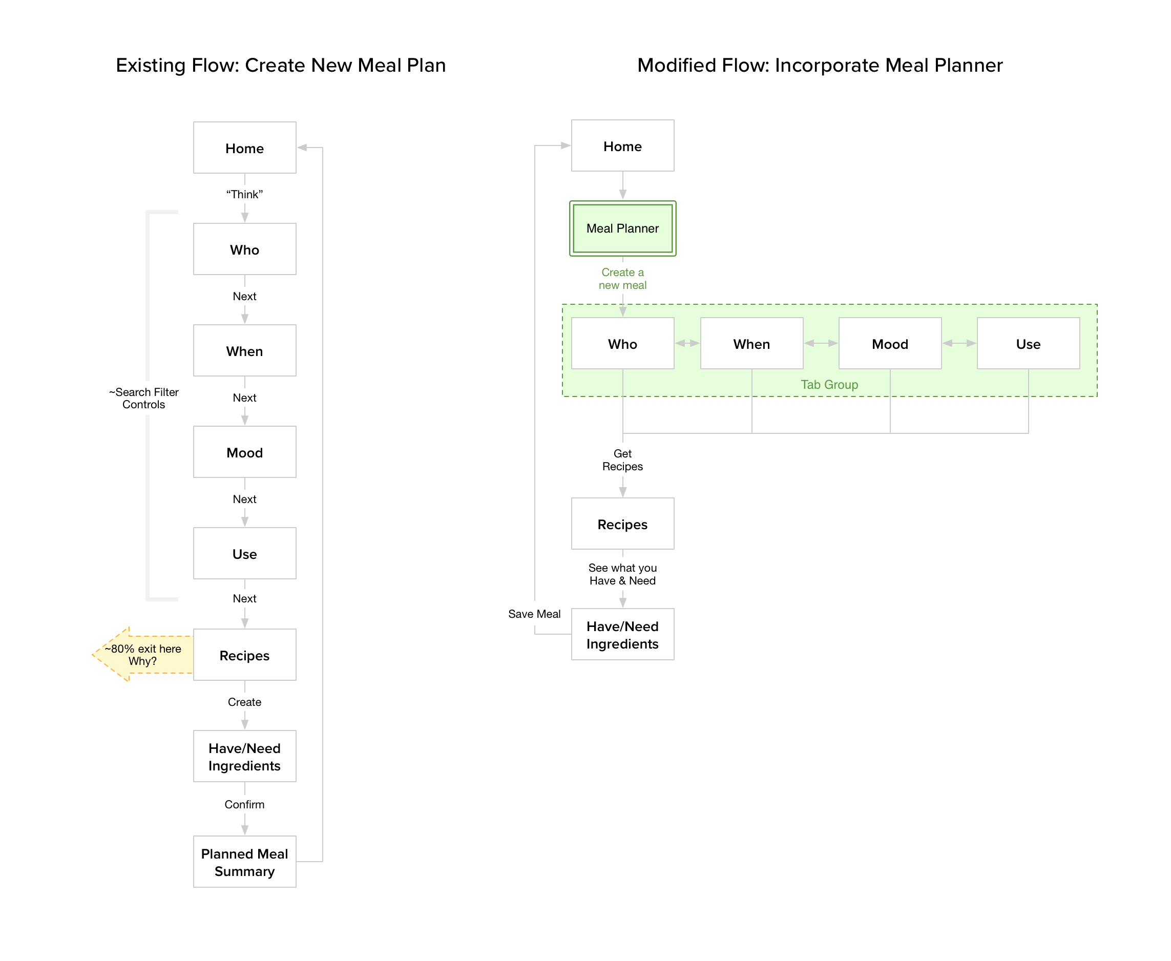
New meal creation flow

Although we wanted to avoid fundamentally changing how the existing new meal flow worked, I did re-organize the search filter screens under tabs to allow users to skip a few screens which now defaulted to their last selection. I proposed changes to some button labels to help better inform user expectations about what was going to happen next.

Initial Meals Concept

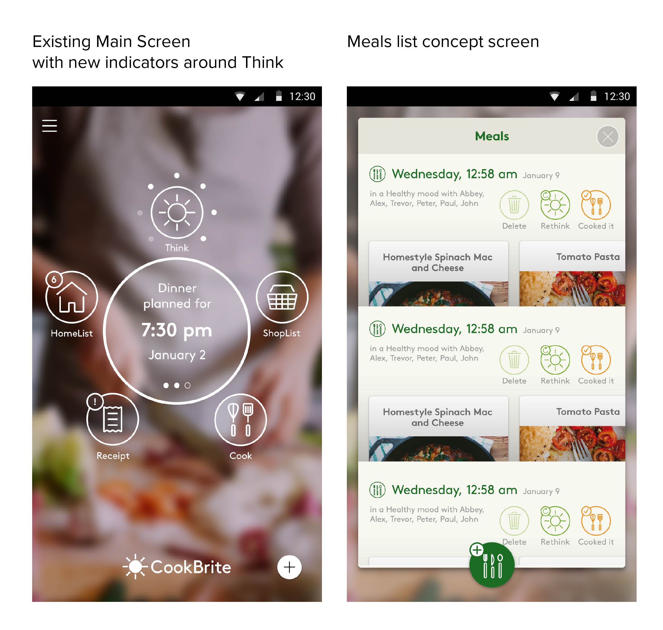
To introduce the team to the idea, I created a few quick mockups to help the team visualize what I was talking about.

I left the existing Main screen mostly untouched, only adding some dots that could be used to visually indicate some information about planned meals.

The initial Meal List concept helped uncover some details about how the current implementation handled planned meals and challenges to supporting multiple meals.

Inspiration vs. Planning

Our analytics indicated that as high as 80% of new users did not complete the meal plan creation process. The reasons for this were an area of on-going debate among the product and design team. Our qualitative research yielded several clues; unsure if they had all the ingredients, unaware of how that would be helpful, or they were just looking for recipe ideas.

One hypothesis was that the initial UX didn’t account for different user contexts, what we eventually called planning mode vs inspiration mode. Many new users trying out the app for the first time were not actually intent on cooking a meal right now. They just wanted it to suggest recipes based on what they said they had and when it did that, they were satisfied. Some users wished out loud that the app would make a shopping list for them, unaware that pressing “Continue” would do exactly that.

So users were somewhat satisfied but not doing what the business needed. We needed them to plan actual meals, but they just wanted to browse recipes.

We hypothesized that creating different places in the app for those different contexts might help clarify the purpose and benefit of the meal planning features, increasing their usage and removing the dissatisfaction caused by forcing them into the planning UX when they just wanted to browse. To do this, I felt we would need to remove the ability to “plan” from the “browse” interface, one interface for finding recipes and another for planning when you’ll cook them.

Initial Meal Planner

This first stab at a visual design mockup included the “DishList” idea from separating planning from inspiration (see above). You could drag dishes out from the DishList onto a planned meal or empty day slot. You could reschedule meals by moving them to new day slots.

We decided to put more work into how we indicated how many ingredients you have vs. need.

Have/Need Indicator Iterations

How can we intuitively indicate how many of a recipe’s ingredients you have vs ones you don’t have?

One insight from user testing was that the app failed to actually show you which recipes you could make with what you have. Recipe representations appeared on 3 different screens in the app and in 3 different sizes; a thumbnail, a vertical card used for search results, and the full-screen detail view with recipe instructions. Ideally, we wanted to integrate a consistent, intuitive visual representation of the “have vs needed” status of ingredients that could be used anywhere a recipe appeared in the app. This would highlight the unique super-power that the app bestowed upon its users.

Initial iterations incorporated feedback from the team. Iterations #3-5 incorporated feedback from user testing I performed on the mockups.

Remove DishList

To limit the initial scope of this feature, we decided to set aside the row of recipes that was an idea to separate “planning” from “inspiration”. This mockup shows the final Have/Need Indicator design and the more subdued colors that bring the recipes to the forefront of the visual hierarchy.

Unscheduled Meals

Because the existing meal creation process did not include any affordance for scheduling meals, this interface needed to include some affordance for meals that have not yet been scheduled for a specific day. We wanted the UX to be flexible enough to support any level of planning vs not planning, but inflect the experience towards planning meals, cooking them and then taking some action once they’ve been cooked so we’d know when meals had been cooked.

Newly planned meals from the existing process would appear in a separate “on deck” section at the top of the Meals list. Users could drag these meals to the day when they planned to cook it, or leave them and just cook them from where they were.

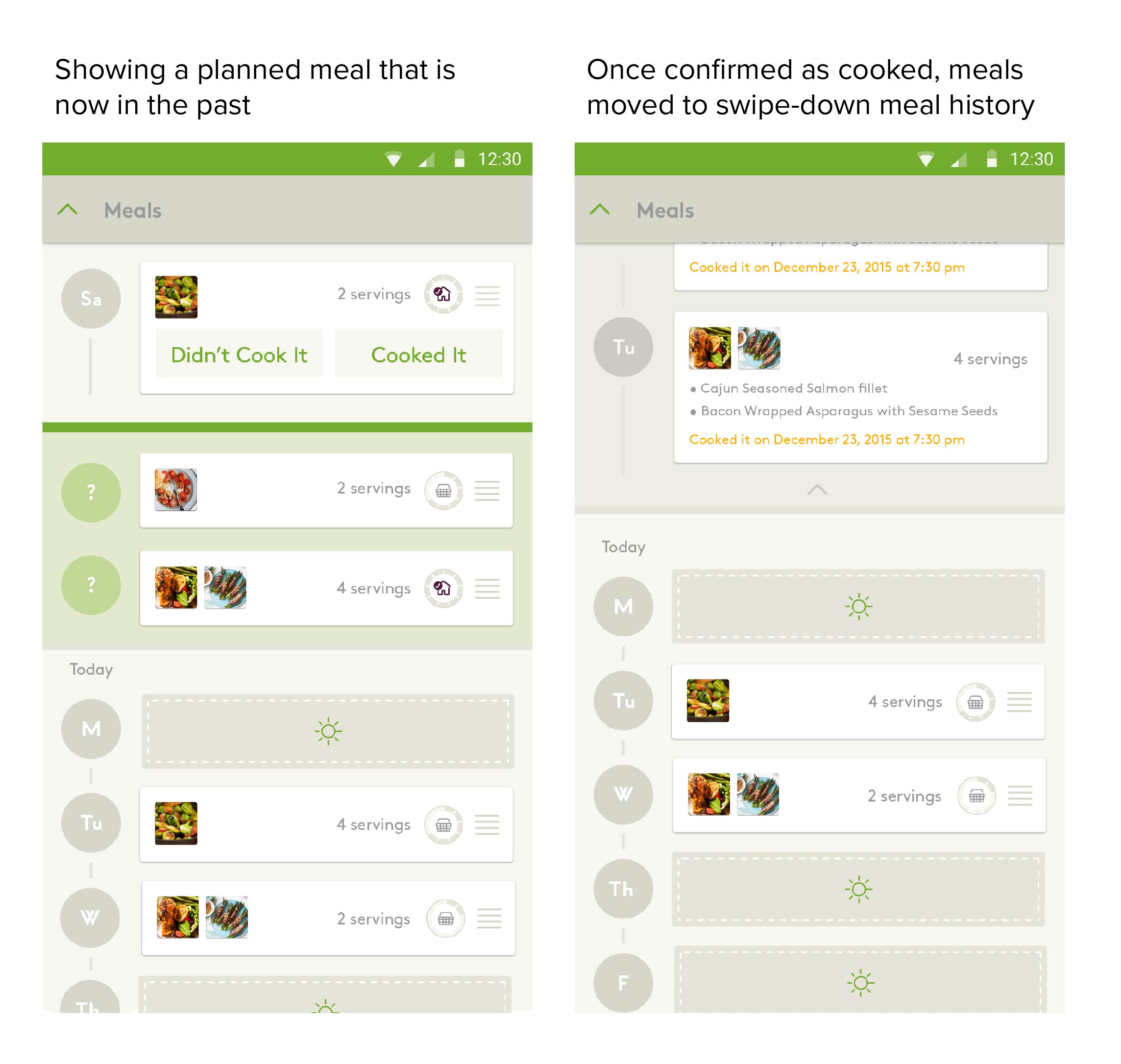
Capturing Cooked Meals

In order to inflect the experience towards capturing when meals were actually, we used the day the meal was scheduled to change the meal’s placement in the interface and provide handy buttons for updating it. We felt this provided flexibility while still inflecting the UX towards meal planning because you could still cook meals without scheduling, but the app gave you some extra help if you scheduled them.

Results

We felt the final visual design accomplished several of our goals; it provided a flexible tool for scheduling new meals. The tool could handle whatever level of detail or ambiguity the user desired with regard to scheduling meals. It remained visually calm and uncluttered while incorporating a new intuitive visual indicator of how many ingredients you need for each recipe.

This interface unfortunately was never fully implemented due to changes in the company’s mission that I’d be happy to tell you about in an interview.

3
CookBrite Receipt Scanning Interface

One of the cool things CookBrite could do was take a photo of your grocery receipt, understand all of the individual items you bought and connect them to recipes that used those ingredients.

Objective

Clear, OCR-able receipt photos

The goal with this interface was to get the user to submit a clear, legible picture of their grocery receipt so the custom OCR system could parse the receipt.

The system that identifies the items on the receipt sometimes needs a human to clarify what an item is. This interface attempts to make the process of identifying unknown items more enjoyable, like a fun matching game.