Case Study

Breathometer

August 2013 - August 2014

Company & Brand Mission

Breathometer got its initial break on the NBC Television show Shark Tank. Their initial product was a pocket alcohol breathalyzer that connected to your smart phone to help you make good driving decisions. They have since continued on to a breath-based health monitor that connects to your smart phone.

My Role

Having worked with the Breathometer CEO at a Plum District, he contacted me to help them create an new landing page in advance of his appearance on Shark Tank. As the company progressed, on a freelance basis I worked with the marketing to develop the brand’s online visual identity, perform user research and explore web-based interfaces for their customers.

Breathomer Pre-Order Landing Page

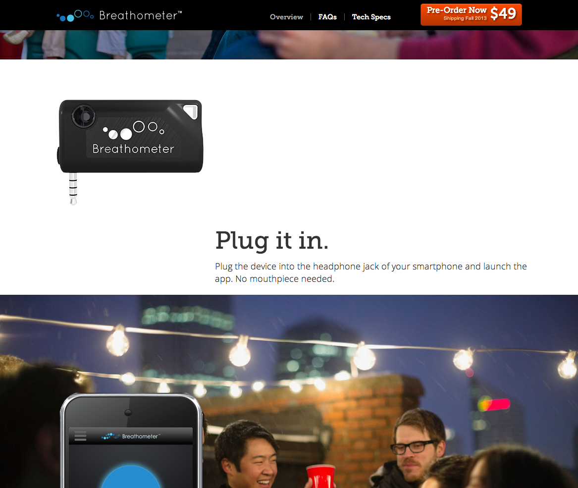
Breathometer needed a new landing page for their product in advance of appearing on ABC’s Shark Tank. The design presented a challenge because there was no actual product yet to take photos of.

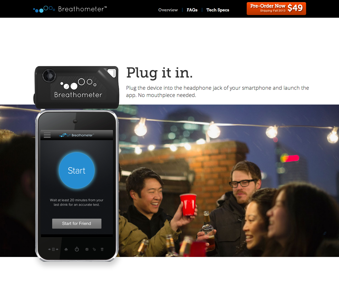
I worked with their Marketing team to develop messaging around an animated introduction to the use of their product using renderings of their product. The product appeared over top of lifestyle photography to help visitors understand how the product could fit into their lives.

The animated landing page was composed of several slides with the Breathometer device transitioning between them to briefly tell the story of using the devices.
In the transition between slides 2 and 3, the device animates down to meet a mock smart phone next to the words “Plug it in”.

Lifecycle Email Campaign

I worked with the Breathometer team to create a series of emails that were sent out in a timed sequence after customers purchased their Breathomter.
Some customer research pointed out that a significant portion of customers did not know how to use the Breathometer properly. This email attempts to give customers the information they needed to successfully use the device and get accurate readings that they understood and could use to adjust their behavior.
The “Re-engage” step of the customer lifecycle for Breathometer is to share their Breathometer with others, who will then want one of their own. In this email we attempt to establish that sharing your Breathometer with others is a fun and normal thing to do with your friends.

Web-Based Device Dashboard

Breathometer asked me for help investigating the design of a web-based dashboard for their users. I performed user research to gain insight into what might be valuable information the dashboard could present to users and then created a simple prototype accessing their data backend.
The research indicated that patterns of usage was the most interesting potential information that a dashboard could provide, so I used the d3.js javascript library to explore different visualizations and produce a graph that allowed people to see how often they used their device and compare it to typical usage patterns of the entire user base.

Site Redesign

After a year it was time to redesign the simple landing page. The company was expanding into other products and needed to incorporate a Shopify-based online store and provide affordance for highlight multiple products while helping to convey the brand’s broader mission.

The new site landing page incorporated some new brand messaging that broadened the company’s focus.

I was inspired by the recently redesigned iOS app and incorporated the use of bold gradient backgrounds into the site design.

The product detail page for Breeze, the new product.
The product detail page for the original Breathometer product.
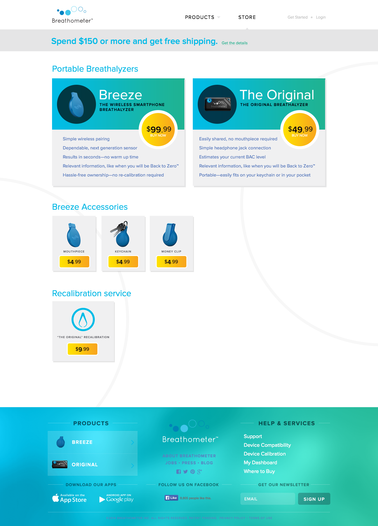
The storefront homepage also exposed device accessories and services.
Product comparison table